Cooktopia
Responsive Web UX/UI design
Cooktopia is an responsive web platform that helps young cooking novices by providing a variety of recipes, nutrition data, and nearby grocery shops, so home cooks could enjoy well-being life based on well-balanced diet.

Role
- Lead designer(UX/UI)

Team
- 3 developers
- 3 designers

Timeline
- 12 weeks

Tools
- Figma
- Adobe Illustrator
- Photoshop
- Google forms
- Trello
1. Problem
According to the study by Seated, the average American couple spends 132 hours a year deciding what to eat. During the Covid era, a growing number of people started cooking at home and have headaches spending time considering what to cook.
“How might we save people's burden from spending thinking of what to cook?”
“How might we differentiate Cooktopia from other existing recipe apps?”
2. Solution
Cooktopia narrowed down to three MVP features, which are extensive filter-based recipe search feature, nutritions visualized charts, and cooking ingredients shopping list.

Users can explore massive recipes data from API by selecting multiple filtered keywords.

Users can get a detailed analysis of the nutrition value with visualization charts.

Users can save ingredients from selected recipes and transfer them to a shopping list.
3. Design Process
USER RESEARCH
Survey

I created the user survey with 10 questions on the initial UX research step. Based on the survey result, I could empathize and understand what users want the most from 46 answers. This survey process helped me to find three main features for CookTopia from users’ perspectives.

* Here are some survey results 2 out of 10 questions which I conducted on google survey .

* Here are some survey results 2 out of 10 questions which I conducted on google survey .
Persona
Based on the proposal of the project and market research, I created a persona to develop and empathize with the end-user of CookTopia. This process helps to set a clear direction to understand the pain points and lead to the goals with necessary solutions.


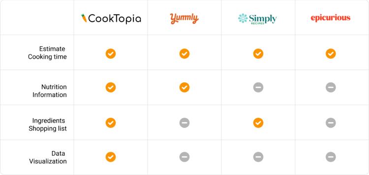
Competitive Analysis
By researching competitors’ strengths and weaknesses, I could end up Cooktopia’s own benefits in the market. This research helped me to focus on a certain problem angle: nutrition visual charts and ingredients shopping list , to stand out from other competitors.
Key Findings
- Users care about their diet balance and health as much as they are interested in new recipes.
- Users expect a recipe web platform that continuously enables them to visit and interact with.
- Users expect variety of recipe data beyond cooking ingredients limits.
^ These key findings are based on below User researches
IDEATION
Based on the three key findings, I built the point of view and refined design challenge to the following opportunity statement. “How might we differentiate Cooktopia from other existing recipe apps?” Finally, I generated three ideas for the project solutions.
Solutions (Main Features)
- Encourage users to visit the web platform frequnetly with more interactions.
- Provide nutrition details for each recipes.
- Allow users to utilize the web platform for further action such as grocery online purchasing.
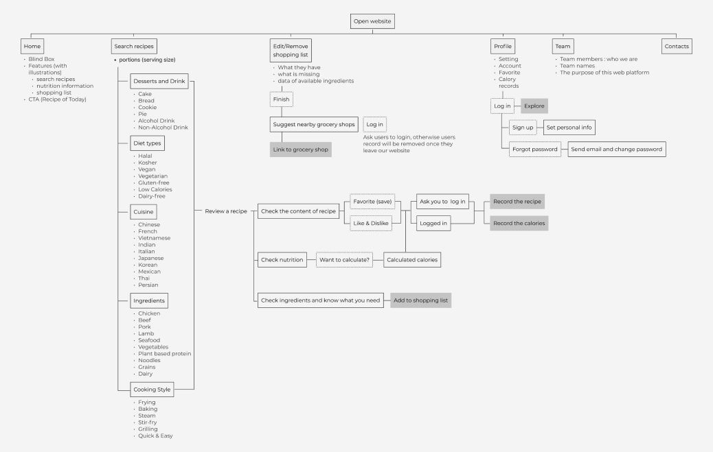
User Flow
Wireframes

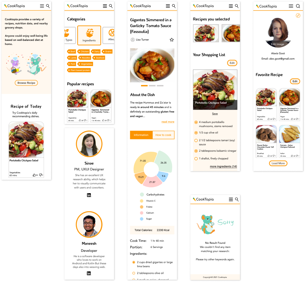
Recipes Page
Annotations:
According to user search, ‘large amount of recipe data’ is the most preferable feature. To help users to access the massive recipe data easily, I designed search function and classified 5 main categories with following detailed filter options based on 4 competitive analysis research.
Due to the space issue for the responsive device screen, the category buttons were redesigned to the swipe cards from side to side.

Recipes Page
Annotations:
More intuitive way to display recipe summary (left sticky) and the cooking details (right main) seperately.
Unlike other recipe apps, Cooktopia provides food nutrition details with visual chart for users who considerate balanced diets and calories.
Users are able to contribute to the recipe popularity rate by clicking ‘like and dislike button’. The interaction affects to ‘recipe of today’ to all users.

Shopping List page
Annotations:
Based on recipes a user has saved, the user can add specific cooking ingredients to the grocery shopping list, which can be linked to further services such as suggested grocery shops nearby. By kindly entering users’ postcode, Cooktopia provides nearby grocery shops details, so that users can get an idea where to buy a certain item effortlessly.

Shopping List page
Annotations:
Each section has the ‘edit’ button, users can easily manage to remove some favorite recipes, shopping lists, calorie records as users wish. Also, the ‘Clear all’ and ‘ Load more’ buttons support taking care of users’ archives more efficiently.
DESIGN
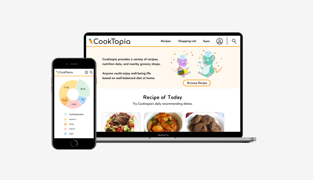
Desktop Mockups
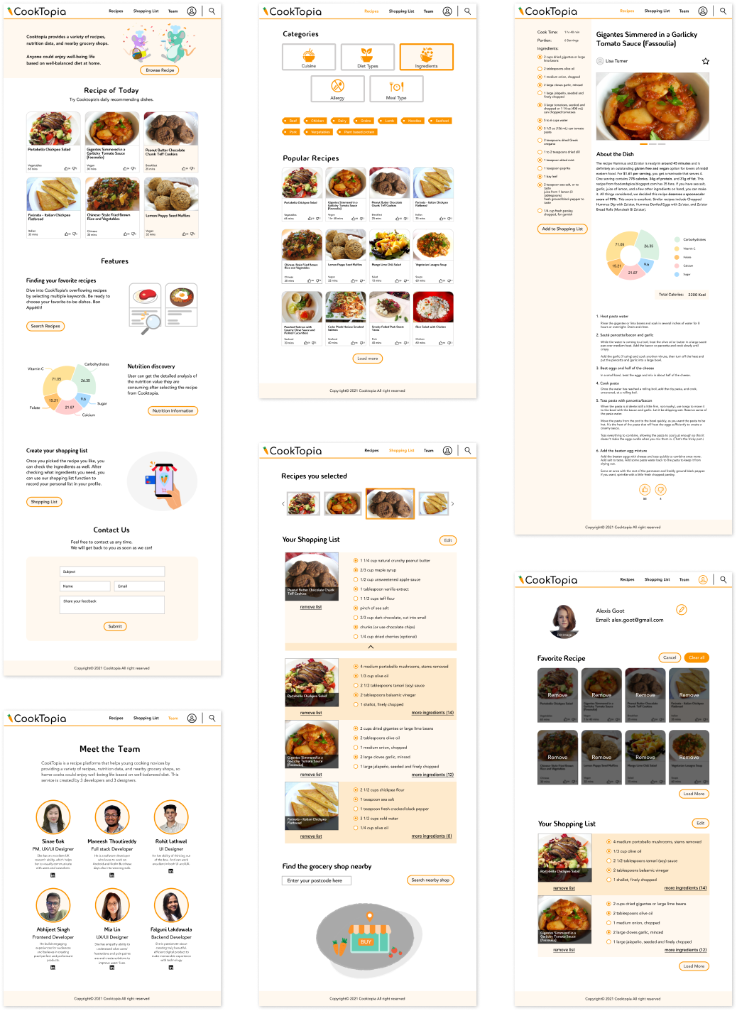
Mobile Mockups