Florish
Mobile UX redesign case study
Florish is an indoor plant helper app for new gardeners who need help picking plants for space or caring for plants they already own. I analyzed the app to redesign the UX design to improve according to users' experiences.

Role
- Product designer

Team
- Personal UX case study

Timeline
- 2 weeks

Tools
- Figma
- Google forms
1. Assessment
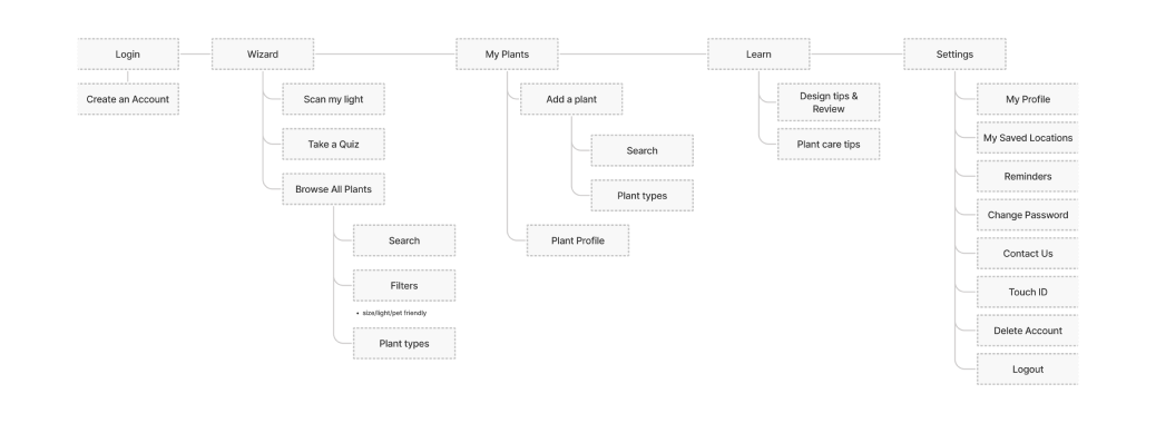
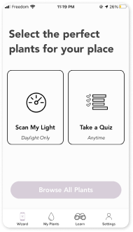
Florish weighs on helping users to choose plants by focusing on lighting-related plant data, and offering simple caring instructions. However, many users including me has the common idea that the app lacks database, unable to customized care scheduling, limited reminder service, and accessibility is low due to mandatory logins.
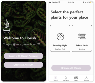
^ Current Florish key screenshots
^ Current Florish key screenshots
^ Current Florish key screenshots
“How might we redesign the mobile experience of Florish to easy-navigated?”

Key Findings
- Users feel challenged to find the appropriate information by identifying the plants.
- Users not only want care instruction but also care schedule and reminder feature the most.
- Users are interested in growing vegitable, so it is better to increase the data for edible plants.
^ These key findings are based on below User researches
2. User Research
SURVEY
I created the user survey with 12 questions on the initial UX research step. Based on the survey result, I could empathize and understand what new gardeners want the most from a plant care app. This survey process helped me to analyze the Florish mobile app from users’ perspectives by avoiding only my personal evaluation.
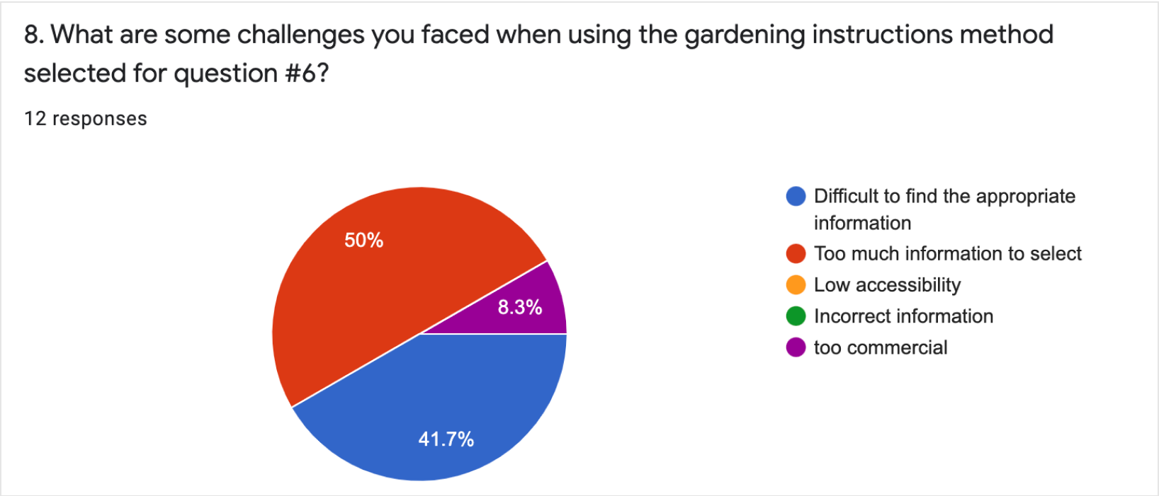
* Here are some survey results 3 out of 12 questions which I conducted on google survey with 13 participants.
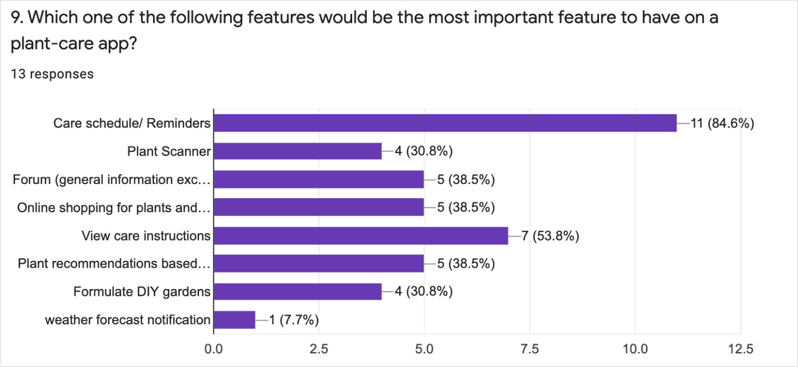
* Here are some survey results 3 out of 12 questions which I conducted on google survey with 13 participants.
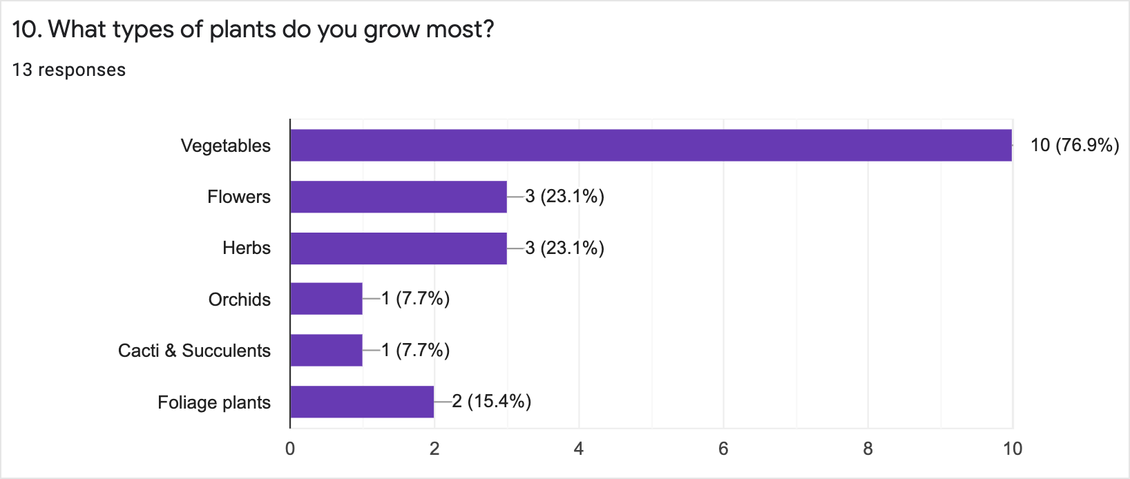
* Here are some survey results 3 out of 12 questions which I conducted on google survey with 13 participants.
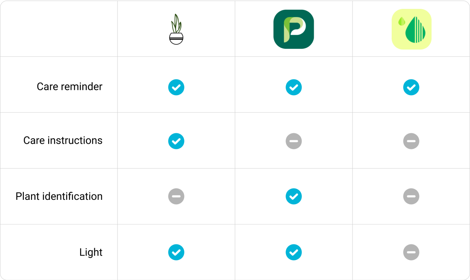
COMPETITIVE ANALYSIS
I believe competitive analysis is one of the most important UX research methods. This is because if UX designer do not know what others are selling in the market, I cannot find the best solutions which would competitive for my own product. Also, it helps me to know what users most expect from the product.
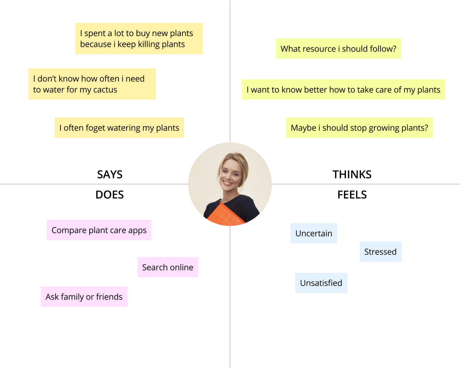
EMPATHY MAP
Empathy map was used throughout the UX process to understand and prioritize users’ needs.
3. Solutions
UX Redesign solutions (Main Features)
- Design easy access to the caring reminder from the home screen.
- Reduce steps to achieve the goal from complicated user flows.
- Allow users to find the data they exactly want by identifying the plants they own.
USER FLOW
Current User Flow
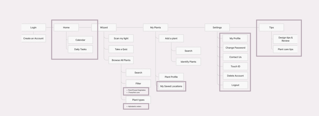
Re-designed User Flow
WIREFRAMES
Before
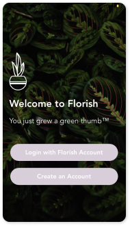
Welcome page
After
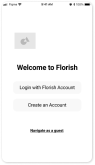

1.
The original UX design assumes all users own their accounts for the app. That causes low access to users for the app, so I added the ‘Navigate as a guest’ button for newcomers to try out the app first.
Before
Wizard
After
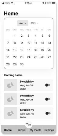
2.
The original UX design does not have home navigation and the feature. Since many users complained about the caring reminder and scheduling, I set them as a default to users access the feature shortly.
Before
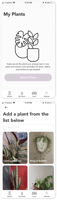
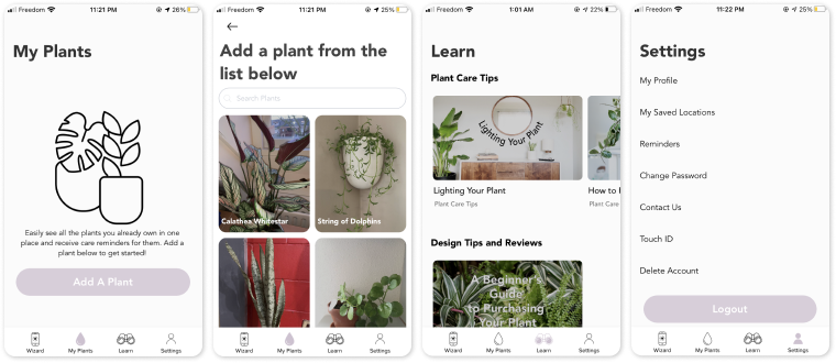
My Plants
After
3.
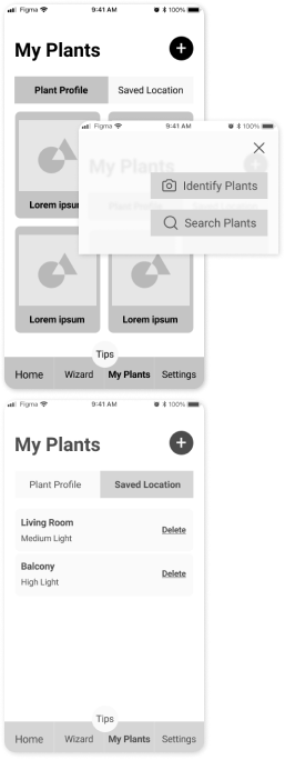
The original UX design requires several steps to check plant profiles, so I created two taps on the My plants’ main page to overview the whole contents easily.
Also by building the plus button on the right top, users can add plants without going back to the previous page, as well as to solve the limited plant data issue. I added the 'identify plants' function let users take a picture of their own plants rather than having given data sets.
"Saved location" tab is relocated from settings, so users can manage all plants related information on "My Plants" page. By adding the "Delete" button on the right side, users have more control over their information.
Before
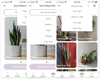
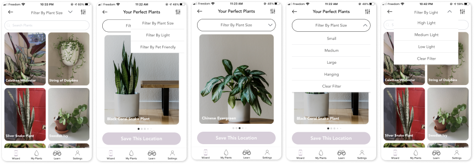
Filter
After
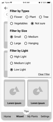
4.
The original UX design has a messy and complicated filter, so users have to click many times to get the final results. Thus, came up with one filter page to make users' journeys shorter and faster.
Before
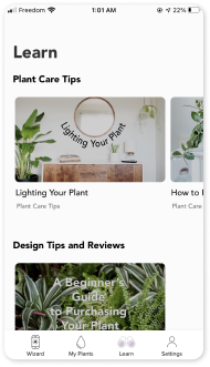
Learn
After
5.
The original UX design has ‘Learn’ navigation, but it only provides a few magazine articles. Thus, I made the feature lighter, which is called tips.
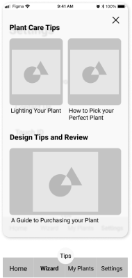
Before
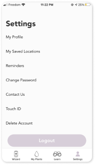
Learn
After
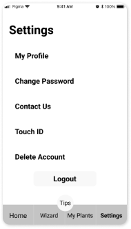
6.
By moving ‘my saved locations’ and ‘reminders’ into 'My Plants' page, the setting page remained simpler.
4. Reflection
I appreciate users’ time, my aim for this project was to help users to use the products and the service as they are demanding. I found that current Floish application has a limited plants' data, complicated user journey, and hidden caring reminder. By performing this UX research, I have learned that companies must implement the features that users need the most, rather than the company want to focus on. Although the company invests lots of cost for a feature they want to emphasize, when users are not interested in it, it is a huge loss at the end of the day. Thus, considering users’ demands in-depth at the beginning is the shortcut to building the complete result by saving the budget.


