Milog
Machine learning data monitoring app UX/UI design
Milog is a machine learning data monitoring app for engineers and data scientists to check algorithm performance on the go with their mobile devices.

Role
- Product designer

Team
- 1 project manager
- 1 developer
- 1 designer

Timeline
- Ongoing

Tools
- Figma
- Adobe Illustrator
- Zoom
- Slack
1. Problem
Data scientists feel uncomfortable about frequently monitoring model training on a computer.
“How might we build an application to easily access and monitor algorithm performance for data scientists?”
2. Assessment
Remote meeting
I had meetings with a project manager remotely. The project manager explained the project, the plan and shared their initial UX process. And we discussed and determined the design direction to confirm branding style and mobile mockup designs.
REQUIREMENTS
- Clean user interface
- Display whole data information
- List new real-time updates
3. Solution
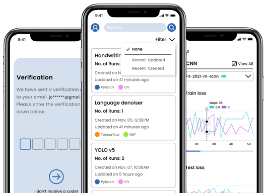
Milog allows data scientists to monitor numerous algorithm performance on the go by searching its job’s name or filtering recently updated and created jobs. Milog displays the massive model training status with the simple and clean user interface.
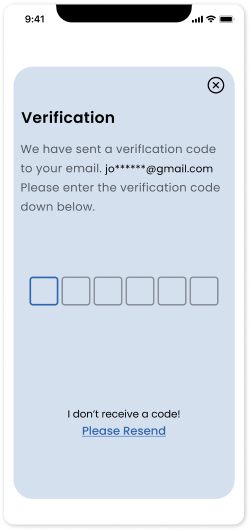
Once users verify their email authentication at the beginning, users can shortly access Milogs data monitor service .
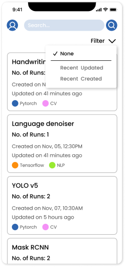
Users are easily able to find a specific job by using search and filter features .
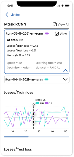
Users can monitor a number of data progression at a glance .
4. Design Process
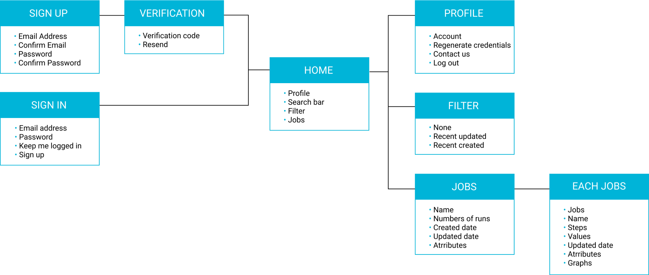
INFORMATION ARCHITECTURE
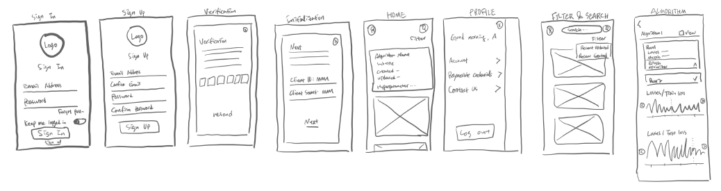
LO-FI WIREFRAMES
PROTOTYPE
5. Reflection
Milog is ongoing freelance work. I am mainly working as a UI designer but I am also involved in the UX design process when it’s necessary. The most challenging part of this work was that I had to grasp the vague UX process in a short period of time and implement UI when all the features were not confirmed. However, as a solo designer, I proactively communicated with a project manager by suggesting UX elements such as filter and search bar, we could end up the current version of the design. We are still working on a responsive design for the tablet devices and continue to improve for the next version.
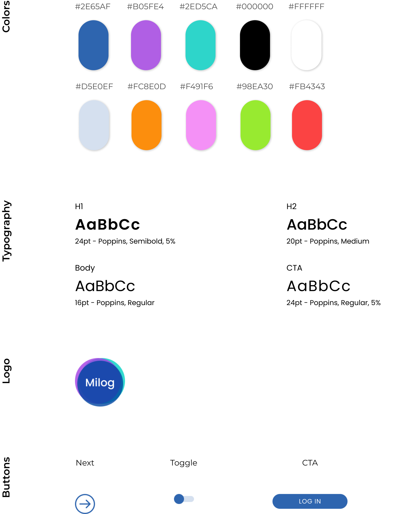
Design library
Milog’s primary colors are bluish shades which are used for the whole design of the app. Black and white are used for text and background colors to produce a clean content-first design. However, to indicate different attributes and graphs, several bright colors are also used for design elements.
Poppins is a geometric sans-serif typeface. Milog focuses on the clear content itself for users to instantly read and compare the data. Thus, Milog used the clean and neat san-serif typeface Poppins for the entire app design.
Since Milog is a new mobile platform, I came up with combination logo which could show it’s identity and the name itself to inform new users. Data could be graphs, diagrams and any visual materials. Overlapping three low opacity colors illustrates futuristic images related to machine learning data monitoring services. Also, it shows that Milog provides enormous data to users to compare with different shades. The logo is designed with bluish hues which symbolized security and trust, which Milog values the most.
I used many colors for differentiate attributes and graphs in main screens. However, I still want to the whole design theme to be clean and professional looking to shine the contents more. So I set tone downed blue alone as the primary color. The overall design is clean and simple, and utilized cards components to group and organize the data details.